Apartment ReDress:: The plan behind the series
A key factor in choosing colors for any project is to think about the overall color scheme of your apartment. What color are the walls, what accent pieces do you have? What are the large pieces of furniture – patterned, solid, bright red, beige? Since Jason and I have been college students living off a mash of cast off furniture and home accessories for a long time, it’s impossible to bring unity to the space. I think the only thing that matches is the silverware (Thanks Carolyn!) and the plates (vintage set for $10). Other than that, mash potato time, with 20 varieties in the mix. How in the world does one unify THAT? Well, I could spend a million bucks, pitch everything and start from scratch, but as you can imagine that is not my style. And sure, maybe our apartment will never be some fancy show house, but I think a creative inviting space is not out of the question. And that is the goal of the ReDress project. Piece by piece, project by project, making our home more of a home instead of just a place to store our stuff and work.
Color has a lot to do with unity more than style. If you have an edwardian style bust on a zebra striped running it will go together – because black and white go. And a lot of really interesting combinations can come from that principle. We have a mash of things and paint is my best friend right now.

You might have seen the kitchen tiles I made. They might seem pretty extreme in color, but with a bright red trash can, dull walls, and our open format apartment, it fits. The 3 foot painting of candy by the entry way is continued into the kitchen space by the tiles. We also have an oil painting of a board game block party above out tv (I went through a phase, maybe I’m still in it, ha!) so with things like that on the walls, it makes sense to have fun bright colors for pillows, table clothes, and say one accent piece of furniture in the room. And a great way to tie in all those colors is to have a nice strong nutural color to ground them. So a charcoal gray slip cover for the couch and chair, light wood finishes, and mild carpet.
The first step in the redress project was to pick 2 grounding colors – light gray and charcoal blue gray – and a few accent colors: kelly green, cobalt blue, light lemon yellow, and cherry red. We already had these colors in our apartment on accident; by adding more of the same colors it looks intentional. Also, instead of just picking my 4 favorite colors, I picked colors that looks nice in combination with each other as well as the grounding colors or just on their own.
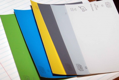
Now, any time I have a choice in the matter, I choose colors that go with this theme. Gray or light wood for big pieces and the 4 bright colors as accents. So when the mistint cart had a gallon of light gray blue for $5 I snatched it up. Also once you pick out your main colors, as you see mistints of the same colors you are using you can pick them up at discount and use them to redress all sorts of housewares! You don’t have to be exact in your colors, just close.
Happy home color mix and matching!
Kristin Roach



I love you out look on this. I have been working on my studio and have been bringing in lots of white for the grounding part, but will be adding some fresh colors soon! Thanks for sharing.
That is so good to hear. I’m glad you are taking steps to make your creative space more creative :) I think we can all get caught up in the process and not think much about actually designing. I’m happy to say I’m rearranging my studio today. I’m really excited to mix things up in here.
I had forgotten about the silverware! Ha ha. I like your idea and of course, I love your recycling of items. Very eclectic! And the color palette – that’s a great thing.
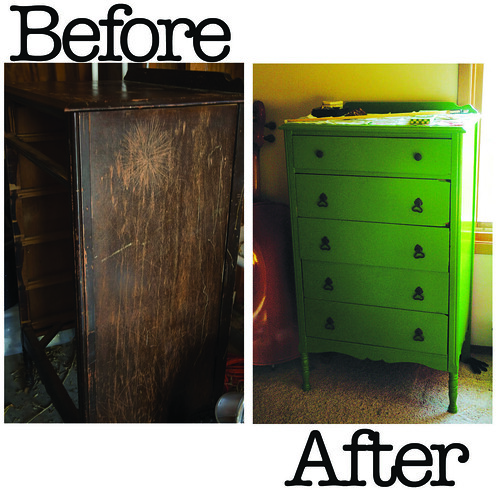
Kelly green is really fascinates color among them. I really like it. You have painted. I also like the kitchen tiles. I am curious to make deal for this tiles.